Today, Android phones are extremely popular. The user base of Android is well over one billion people. The Google platform has seen great improvement in various areas such as battery life, faster apps which use less memory, improved programming APIs and UI. In an effort to better the UI experience, introduced ‘Material Design’ with an intention to bridge the gap between the real and digital world.
The technology giant took inspiration from the physical world of paper and ink and applied it to the digital world in the form of material design. This material can reform, expand and reshape according to specific requirements. It’s nothing short of a design revolution by Google. Many UI and UX professionals prefer material design over other traditional design approaches. The motive behind it is simple - Make the user experience better through classic principles of good design that will lead to a unified experience across all devices and platforms. Moreover, material design extends even to laptops.
Now, let’s look at it conceptually. The material is an object in the 3D world, which has X, Y and Z dimensions. While other approaches just focused on the X-Y plane (horizontal and vertical), material design takes even the Z plane into consideration. It is this fundamental difference which gives a realistic ‘feel’ to the end user.
Google has laid down three important principles lay the foundation of Material design:
Material is the metaphor:
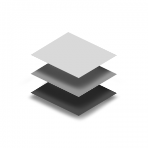
The metaphor here is to share knowledge and thoughts about materials in-depth. Sharing leads to unification of the design across the entire Android ecosystem which includes mobile, tablet, auto, wearables and desktop. In reality, it’s the surfaces and edges which give us information about materials. The digital world however can supersede the physical world. The material design surface consists of tangible objects – layers and sheets of paper (quantum) but unlike ordinary paper they are able to stretch, connect and change their shape.
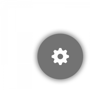
Going in further detail, this surface is nothing but a container which casts a shadow but it differentiates one object from another and shows us how they are positioned relatively to each other. Android follows the Elevation property to cast a shadow which enables it to consider the Z-plane.
Bold, graphic, intentional:
Colour is an important means of expression in Google’s Material Design. In ‘quantum paper’ color is extremely important. A standard material design colour palette consists of main and accent colors. To create your own brand, Google suggests use of the palette defined at their design site. These colours can be used effectively to guide the user’s attention towards key elements in your screen. Material design even describes different opacity levels for primary texts, secondary texts and hint texts which makes for good visual hierarchy on the device screen.
The design emphasizes bold shadows and highlights. Traditional flat design doesn’t contain stylistic enhancements that simulate three-dimensional objects. This increased depth of focus is significantly important to the users that help them to access through the application gracefully.
Google recommends using Roboto font which is slightly wider and rounder, giving better clarity on screen. I have used Roboto for one of my work projects and have been quite impressed with it!
Motion provides meaning:

If you think of your mobile devices, it’s really the motion which tells a story onscreen. It focuses and considers the user as the primary mover. And the motion of material defines its property. The user is also the driver for change. Sometimes, it is difficult for a user to know where to look or understand how an element got from point A to point B. Planned motion design can effectively guide the user’s attention avoiding confusion and improving the experience.
Animation with unexpected starts and stops or rapid changes in direction appears can be a surprising and unpleasant distraction for the user. Animations should be clear and synchronized. Material design follows the basic laws of motion to deliver a better user experience. Google has also provided a wide variety of meaningful animations including ones for wearables.
The first glimpse of Google's material design appeared with Android Lollipop. It can be used in devices with the Android version 2.1 and above using support library v7, which covers almost all the Android devices built after 2009. Recently, support library v7 has been revised to number 22.1, increasing the robustness of material design.
In my opinion, the prime motive behind the material design is to give users a seamless experience for all the devices and applications in the Android ecosystem. W Google is really materializing the entire user experience chain.
Hopefully, this blog article helped you with a clearer understanding of material design. Material design is a broad subject and I have laid out some very basic facts. I will come up with more articles on material design which explore the subject more deeply. Would love to hear your views on the subject and blog suggestions, if any.
References:
http://www.google.com/design/spec/material-design/introduction.html