In today’s world of digitization, we come across a lot of devices in our day-to-day lives. We have advanced smart phones, smart watches, IoT enabled devices and so on. These all devices communicate with us through a screen or a display. And, these screens are more superior with regards to not only screen sizes but based upon their resolution or pixel density. The sharpness of the screen defines the quality of screens.Any video display consists of the rectangular array of pixels. The visual object display on the screen has a pixel size. Previously, programmers had to size and position visual objects in terms of pixels. But as there are greater variety of screen sizes and pixels densities, working with pixel became undesirable for programmers attempting to write application that look roughly same on many devices.
Both Apple and Microsoft devised system for desktop computing that allow programmers to work with display in some form of display dependent units instead of pixels. So, most of the developers specify their display objects in terms of device-dependent units. Now, it is the responsibility of the Operating Systems to convert back and forth these units and pixels.
In the apple world, desktop videos’ displays were traditionally assumed to have a resolution of 72 units of an inch. This number comes from typography, where many measurements are in units of points. In digital typography, the point has been standardized to be exactly one seventy-second of an inch. Working with points rather than pixels, a programmer has an intuitive sense of the relationship between both numeric size and the area that visual objective occupy on the screen.
In the windows world, a similar technique was developed, called device - independent pixels (DIPs) or device - independent units (DIUs). To a windows programmer, desktop video displays are assumed to have a resolution of 96 DIUs.
Mobile devices, however, have somewhat different rules. The pixel densities achieved on modern phones are typically much higher than on desktop displays. The higher densities allow text and other visual objectives to shrink much more in size before becoming illegible.
Phones are typically held much closer to user's face than in desktop/laptop screen. This implies that visual object on phone can be smaller than compatible object on desktop, as the physical dimensions of phone are much smaller than desktop displays.
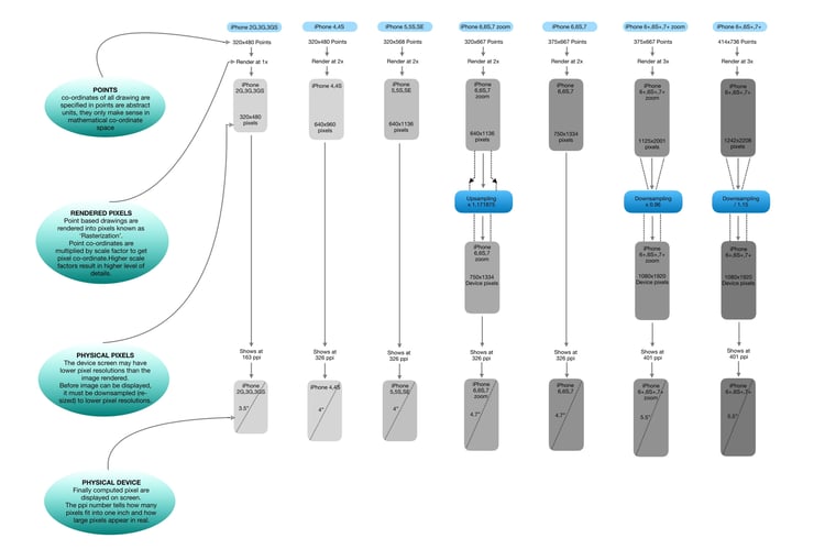
Apple continues to refer to the device - ind units on the iPhone as points. All of Apple's high density displays which apple refers to by brand name "Retina", have a conversion of 2 pixels to the point. This was true for the Macbook Pro, iPad and iPhone. The recent exception is the iPhone 6 Plus/7 Plus which have 3 pixels to the point.

640*960 pixel dimension of 3.5 inch screen of iPhone 4 has an actual pixel density of about 320 DPI. There are 2 pixels to the point, so to an application program running on iPhone 4, the screen appears t have a dimension of 320*480. The iPhone 3 actually did not have a pixel dimension of 320*480, and points equaled pixels. so to a program running on these 2 devices, the display of iPhone 3 & 4 appear to be same size. The graph Object and texts are displayed in greater resolution on the iPhone 4 than iPhone 3.
For the iPhone 3 & 4, the relationship between screen size and point dimension implies a conversion factor of 160 points to the inch rather than desktop std 72. The iPhone 5 has a 4 inch screen, but pixel dimension is 640*1136. To a program, this screen has a size of 320*768 points.
The iPhone 6 has a 4.7 inch screen & pixel density is also 320 DPI. There are 2 pixels to the point, so to a program the screen appears to have a point size of 375*667.
However, the iPhone 6 plus/7 plus a 5.5 inch screen & pixel dimension of 180*1920 which is a pixel density of 400 DPI. This higher pixel density implies more pixels to the point, and for iPhone 6 plus, Apple has set the point equal to 3 pixels. That would normally imply a perceived screen size of 360*640 points, but to a program the iPhone 6 plus screen has a pint size of 414*736. so the perceived resolution is about 150 points to the inch.
Here are some technical terms associated with display resolutions:
- Pixels: Smallest element that can be displayed on a screen (Single dot on a display).
- Resolutions: Displays are measured in size (cm/inch). Here we only measure the diagonal size and not the horizontal & vertical size. There is another important property of display which is the resolution. Resolution refers to size of display in terms of pixels, e.g. resolution of 800*600 pixels means that there are 800 pixels horizontally & 600 pixels vertically (Total 480000 pixels).
- Pixel Density: Defines the sharpness and clarity. Pixel density is usually measured in PPI, which refers to the number of pixels present in per inch of the display. Higher the pixel density, higher is the sharpness of the content. Pixel density is calculated based on resolution & size of the display.
Pixel Density =Root ((Horiz. No. of pixels ^2)+(Vert. No. of Pixel ^2) )/Screen size. The human eye cannot see the individual pixel if the human is viewing the display from 3-4 feet distance. In case of smart phones, they are designed to use in just 1-2 feet distance, so we can feel better sharpness only if display has greater pixel density. Hence, they are manufactured with higher pixel density compared to TV. - Rasterization: The task of taking an image described in the vector graphics format and converted it into a raster image (pixels or dots) for output on video display.
Through the down-sampling magic, 1242px by 2208px content of iPhone 6 plus will be rendered into 1920px by 1080px display at the same 5.5 inch physical size.
