JavaFX 2.x has many fascinating and useful controls. Among them “TabPane” is also one of the control. Here I am not going in detail about TabPane control, but I would like to inform that there might be some situations where we would like to have a control particularly like the TabPaneHeader ie., adding buttons/nodes dynamically and the scrolling behavior. For example, creating a custom browser layout, adding options scroll in the ribbon bar etc... The basic idea of developing this control is taken from Mozilla tab control.More or less this also includes the behavior of Horizantal ListView. :-)
The source code of the control with the demo application is available here. The executable jar for the demo application can be found here.
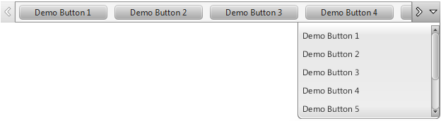
Now about the control, the purpose of this control is to add or remove nodes in a horizontal resizable scrollable control. Below is the screenshot of the basic Scroller control which gives you a quick idea about it.
The code to instantiate the control and set the items (nodes) is shown below.
Scroller<button> scroller = new Scroller</button><button>(); ObservableList</button><button> buttonList = FXCollections.observableArrayList(); scroller.setItems(buttonList); scroller.setShowMenu(false); </button>
A menu button is provided to scroll to the desired button. A property “showMenu” is provided to show/hide this menu button as per requirement. And by default this is set to “true”. Also a property to set the menu direction is added. And currently it accepts only Direction.UP or Direction.DOWN enums as its value. And by default this is set to Direction.DOWN value.
Scroller with downward menu direction:
Scroller<button> scroller = new Scroller</button><button>(); scroller.setItems(buttonList); </button>
And the resulting output is shown as below.

Scroller with upward menu direction:
Scroller<button> scroller = new Scroller</button><button>(); scroller.setItems(buttonList); scroller.setMenuDirection(Direction.UP); </button>
And the resulting output is shown as below.

Setting default no of items in menu:
There might be some situations where the menu can grow longer and a scroll is needed to minimize the menu height. The property “defaultMenuItemsCount” will accept the count of menu items to be shown in the menu without scroll. If the items count exceeds this value, then the scrollbar is shown in the menu. The default value for this property is 10.
Below is the code to set the default item count in menu.
Scroller<button> scroller = new Scroller</button><button>(); scroller.setDefaultMenuItemsCount(5); scroller.setItems(buttonList); </button>
And the resulting output is shown as below.
Adding nodes other than buttons
Till now we have added “Buttons” as the items to the Scroller. Let’s go further by adding custom nodes as items to the Scroller. Currently there is strict rule like the items (nodes) should only be of type “Region” or “Control”; it will not accept “Group” as its item. The reason for this is, the internal logic to scroll the items will depend on the widthProperty of each item. And as “Group” cannot provide the width, temporarily I have kept this restriction. Need to check how to solve the issue ;)
To show these items “names/titles” in the menu, I am using the “getUserData” method of the node to get the string value of the provided item. So another strict rule, we have to set the “userData” to the Scroller items to show them in the menu.
For reference below I am providing two types of custom nodes which are passed as items to the Scroller.
Item Type 1: (HBox)
The code for the type 1 button is as follows:
public class ItemType1 extends HBox{
 private Hyperlink deleteButton;

public ItemType1(String str){
  super();
  if(str==null){
   throw new UnsupportedOperationException("Name cannot be null for the item");
  }
  setUserData(str); // **Mandatory
  setMinWidth(150);
  setMinHeight(26);
  setAlignment(Pos.CENTER_LEFT);
  getStyleClass().add("item-type-1");

  deleteButton = new Hyperlink("X");
        deleteButton.setStyle("-fx-padding: 0; -fx-text-fill: blue");
        StackPane sp = StackPaneBuilder.create().alignment(Pos.CENTER_RIGHT).children(deleteButton).build();
  getChildren().addAll(new Label(str),sp);
        HBox.setHgrow(sp, Priority.ALWAYS);
 }

 public void setDeleteAction(EventHandler event){
  deleteButton.setOnAction(event);
 }
}
And passing these items to the Scroller
Scroller scroller = new Scroller();
scroller.setSpacing(6D);
scroller.setMenuDirection(Direction.UP);
scroller.setItems(getItemType1MockData(scroller));
scroller.getStyleClass().add("itemType1-scroller");

private ObservableList getItemType1MockData(final Scroller scroller){
  ObservableList list = FXCollections.observableArrayList();
  for (int i = 1; i < 10; i++) {
   final ItemType1 btn = new ItemType1("Demo Button "+i);
   btn.setDeleteAction(new EventHandler(){
             public void handle(ActionEvent event)
             {
              scroller.getItems().remove(btn);
             }
         });
   list.add(btn);
  }
  return list;
 }
And the resulting output is shown as below.
If you notice, the basic styles of Scroller are overridden to customize the background. Likewise, you can customize the styles of the arrow buttons.
If the item is selected or clicked from menu, the OnMouseClicked event handler of the item is called to perform the required action. (If declared)
Item Type 2: (StackPane)
The code for the type 2 button is as follows:
public class ItemType2 extends StackPane{
 public ItemType2(String str){
  super();
  if(str==null){
   throw new UnsupportedOperationException("Name cannot be null for the item");
  }
  setUserData(str); // **Mandatory
  setMinSize(100, 80);
  setAlignment(Pos.CENTER);
  getStyleClass().add("item-type-2");
  getChildren().addAll(new Label(str));
    }
}
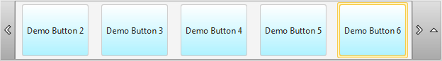
And the resulting output of the Scroller if the above node is passed as item is:
Spacing between Items:
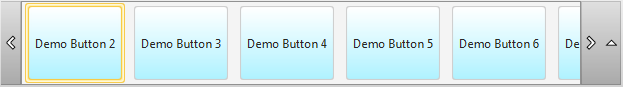
Another feature which I thought to make it as configurable property is “spacing” between Scroller items. The “spacing” property is added in Scroller control, where we can configure the spacing between the items using setter and getter methods. The default value for this property is “10”.
In the above Item Type 2 example after configuring the spacing, the output is as below.
scroller.setSpacing(12d);
KeyBindings for Scroller:
On press of the following keys, the Scroller behavior is defined accordingly:
- KeyCode.HOME: Scrolls to first item.
- KeyCode.END: Scrolls to last item.
- KeyCode.LEFT: Scrolls one item to left side. Similar to the action of pressing the “
- KeyCode.RIGHT: Scrolls one item to right side. Similar to the action of pressing the “>” arrow button.
- KeyCode.DOWN: Displays the menu if the properties “showMenu” is set to true and “menuDirection” is set to “Direction.DOWN”.
- KeyCode.UP: Displays the menu if the properties “showMenu” is set to true and “menuDirection” is set to “Direction.UP”.
That’s it for now :-). There are other plans of adding more features to this control., Like showing the selected item in the menu, adding ScrollerButtonsPolicy to show the buttons by default or not., etc..
The source code of the control with the demo application is available here. The executable jar for the demo application can be found here.
I request you to play with this control and let me know if you encounter with any issues or bugs. :-)