One of the very interesting features of JavaFX is its ability to have gradients (Linear or Radial) to the background color of the nodes. In this blog I am going to explain in detail about each gradient and its parameters.
Inspired from “Scene Builder” and “Scenic View” applications, I have worked on building a “Gradient Builder” application, which will let the user to see the changes of the gradient visually (instantly) and copy the generated CSS syntax for that gradient. I was very surprised to see the gradient features when I actually started developing/working with this builder. I hope you will also like/enjoy it :-).
The source code for the “Gradient Builder” can be found here. And the executable jar can be found here. I would like to thank "jsmith" for providing the code for color picker. For a quick overview about this application you can watch the video at the end of this blog.
[Update] : The "Gradient Builder" for JavaFX 8 can be found here.
In this blog, for better understanding, I have used Rectangle and Circle shapes interchangeably where ever required.
Linear Gradient:
With reference to JavaFX2 CSS Reference Guide, the syntax for linear gradient is
linear-gradient( [ [from <point> to <point>] | [ to <side-or-corner>], ]? [ [ repeat | reflect ], ]? <color-stop>[, <color-stop>]+)
The above syntax contains four possible parameters required to build a linear gradient. Which are:
- from <point> to <point>
- to <side-or-corner>
- repeat | reflect
- color-stop
The “?” in the syntax indicates that this parameter is optional. So from the above list 1, 2 and 3 are optional. And the “+” indicates that there can be multiple color-stops in the syntax.
from <point> to <point>
As in the spec, “Linear gradient creates a gradient going through all the stop colors along the line between the "from" and the "to" . If the points are percentages, then they are relative to the size of the area being filled. Percentage and length sizes cannot be mixed in a single gradient function”.
This ‘from’ parameter is optional. As the name specifies, the gradient effect will be started from the given points. And the rule is that if ‘from’ parameter is present, it has to be followed by a ‘to’ parameter.
In other words, a ‘from’ cannot exists without a ‘to’ but a ‘to’ can exist without ‘from’. If only ‘from’ is declared and ‘to’ is not added then the below error is displayed in the console.
WARNING: com.sun.javafx.css.parser.CSSParser declaration Expected 'to' while parsing '-fx-background-color'
Here <point> means the X and Y co-ordinates values. And this value can be in “px” or “%” units. (Like, from 0px 10px or from 20% 30% ). As specified in the spec a combination of “px” and “%” is not valid. So the syntax from 10px 30% is invalid.
Below are the examples of linear gradient when used with from and to with two color-stops.
.linear-grad1{
   -fx-background-color: linear-gradient(from 25px 25px to 100px 100px, #dc143c, #32cd32);
}

.linear-grad2{
   -fx-background-color: linear-gradient(from 25% 25% to 100% 100%, #dc143c, #32cd32);
}

In the above image, both the rectangles are of same size, same values and same color stops are used. The only difference is that, for first rectangle “px” is used and for second rectangle “%” is used.
to <side-or-corner>
‘to’ parameter can be followed by three kinds of values. Among the three, two are already discussed in above description. (i.e. ‘px’ and ‘%’). As already described, the ‘to’ parameter can be declared without ‘from’ but with a separate set of values. The following are the possible values of ‘to’ if it is declared individually without ‘from’
- top
- right
- bottom
- left
- top left
- top right
- bottom right
- bottom left
So the simple rule is,
- If from is included, the ‘to’ value will be in either ‘px’ or ‘%’.
- If from is not included, the ‘to’ value will be the one in the above 8 options.
If neither [from <point> to <point>] nor [ to <side-or-corner> ] are given, then the gradient direction defaults to 'to bottom'.
Below are the different gradient results when used with the above 8 options for the same color stops.
.linear-grad-to-bottom{
    -fx-background-color: linear-gradient(to bottom, #ff7f50, #6a5acd);
}

.linear-grad-to-top{
    -fx-background-color: linear-gradient(to top, #ff7f50, #6a5acd);
}

.linear-grad-to-left{
    -fx-background-color: linear-gradient(to left, #ff7f50, #6a5acd);
}

.linear-grad-to-right{
    -fx-background-color: linear-gradient(to right, #ff7f50, #6a5acd);
}

.linear-grad-to-bottom-left{
    -fx-background-color: linear-gradient(to bottom left, #ff7f50, #6a5acd);
}

.linear-grad-to-bottom-right{
    -fx-background-color: linear-gradient(to bottom right, #ff7f50, #6a5acd);
}

.linear-grad-to-top-left{
    -fx-background-color: linear-gradient(to top left, #ff7f50, #6a5acd);
}

.linear-grad-to-top-right{
    -fx-background-color: linear-gradient(to top right, #ff7f50, #6a5acd);
}

repeat | reflect
Applying this parameter will make the gradient to repeat in cycles. Frankly speaking, I couldn’t get a proper example to show the exact difference between ‘repeat’ and ‘reflect’. Once I get a proper example I will update in this blog.
If neither repeat nor reflect are given, then the CycleMethod defaults "NO_CYCLE".
Below are the examples of using ‘repeat’ and ‘reflect’. The code to generate this gradient is very simple but the output it produces is simply amazing :-).
The linear gradient without repeat or reflect is as below.
.linear-grad-without-repeat{
     -fx-background-color: linear-gradient(from 13px 38px to 52px 52px, #d2691e, #ffa500 100%);
}

After applying the “repeat” or “reflect” the gradient is changed as below.
.linear-grad- repeat1{
     -fx-background-color: linear-gradient(from 13px 38px to 52px 52px, reflect,  #d2691e, #ffa500 100%);
}

.linear-grad- repeat2{
     -fx-background-color: linear-gradient(from 41px 34px to 50px 50px, reflect,  #ff7f50 30%, #faebd7  47%);
}

.linear-grad- repeat3{
     -fx-background-color: linear-gradient(from 30% 30% to 23% 30%, repeat,  #e9967a 62%, #ff8c00 88%);
}

In the above examples the color stop is followed with some percentage values. I will discuss about them in next section.
color-stop
The color-stop is a valid color code in hex value or RGB or the pre-defined color name. Any of these three can be used. And for any gradient there must be present at least one color stop.
There is another parameter that can be followed to the color code, which will specify the percentage value to which the actual color will render. Of course this is an optional value.
The below example can give more idea about color stop and the percent value.
.linear-grad- color-stop{
     -fx-background-color: linear-gradient(#0000ff 20%, #ff8c00 65%, #ff0000 100%);
}

Radial Gradient:
As in the API doc, “The RadialGradient provides a way to fill a shape with a circular radial color gradient pattern. The user may specify 2 or more gradient colors, and this paint will provide an interpolation between each color.” With reference to JavaFX2 CSS Reference Guide, the syntax for radial gradient is
radial-gradient([ focus-angle <angle>, ]? [ focus-distance <percentage>, ]? [ center <point>, ]? radius [ <length> | <percentage> ] [ [ repeat | reflect ], ]? <color-stop>[, <color-stop>]+)
The above syntax contains six possible parameters required to build a radial gradient. Which are:
- focus-angle <angle>
- focus-distance <percentage>
- center <point>
- radius [<length> | <percentage> ]
- repeat | reflect
- color-stop
The “?” in the syntax indicates that this parameter is optional. So from the above list 1, 2, 3 and 5 are optional. And the “+” indicates that there can be multiple color-stops in the syntax.
focus-distance
I am explaining “focus-distance” first because, without a focus-distance, specifying the “focus-angle” makes no difference in the gradient.
It is the distance from the center of the gradient to the focus point to which the first color is mapped. The value of the focus-distance is specified in “%”. By default the focus is placed at the “center” of the gradient. The positive values will move the focus towards right and the negative values towards the left.
Below are the gradient results when the focus-distance is increased in positive value. (Observe that the focus is moved towards right)
.grad1{
   -fx-background-color: radial-gradient(focus-distance 0% , center 50% 50% , radius 55% , #7cfc00, #ff0000);
}

.grad2{
   -fx-background-color: radial-gradient(focus-distance 59% , center 50% 50% , radius 55% , #7cfc00, #ff0000);
}

.grad3{
   -fx-background-color: radial-gradient(focus-distance 100% , center 50% 50% , radius 55% , #7cfc00, #ff0000);
}

Below are the gradient results when the focus-distance is decreased in negative value. (Observe that the focus is moved towards left)
.grad1{
   -fx-background-color: radial-gradient(focus-distance 0% , center 50% 50% , radius 55% , #7cfc00, #ff0000);
}

.grad2{
   -fx-background-color: radial-gradient(focus-distance -59% , center 50% 50% , radius 55% , #7cfc00, #ff0000);
}

.grad3{
   -fx-background-color: radial-gradient(focus-distance -100% , center 50% 50% , radius 55% , #7cfc00, #ff0000);
}

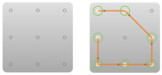
Ok till now everything is fine, that we can move the focus left or right from the center point. But what if the gradient requires to have the focus at other points in the circle which are not in the same line. (As in the below circle)

So for the above scenario, ‘focus-angle’ comes into picture.
focus-angle
It is the angle in degrees from the center of the gradient to the focus point to which the first color is mapped.
The below figure gives the pictorial explanation of the focus angle.

In the above figure, the red dot is the center of the gradient and the green dot is the focus point. Initially both the dots will be at same point (center). After applying some ‘focus-distance’ the green point will be moved towards right and by applying the ‘focus-angle’ the focus can be moved to the desired point.
focus-angle value can range from 0 deg to 360 deg which moves the focus in clock wise direction. (Of course, with negative values the focus will move in anti-clock wise direction).
I think by this time you get the reason for my initial statement “without a focus-distance, specifying the ‘focus-angle’ makes no difference in the gradient”. If there is no focus-distance, the center and focus will be at same point, and the focus point is rotated at the same point which results in no difference in the gradient.
For the last scenario described in ‘focus-distance’, below are the gradient results for all the yellow dots when used in combination with ‘focus-angle’ and ‘focus-distance’.
.grad-angle-1{
   -fx-background-color: radial-gradient(focus-angle 54deg , focus-distance 40% , center 50% 50% , radius 55% , #7cfc00, #ff0000);
}

.grad-angle-2{
   -fx-background-color: radial-gradient(focus-angle 77deg , focus-distance 70% , center 50% 50% , radius 55% , #7cfc00, #ff0000);
}

.grad-angle-3{
   -fx-background-color: radial-gradient(focus-angle 122deg , focus-distance 72% , center 50% 50% , radius 55% , #7cfc00, #ff0000);
}

.grad-angle-4{
   -fx-background-color: radial-gradient(focus-angle 160deg , focus-distance 36% , center 50% 50% , radius 55% , #7cfc00, #ff0000);
}

.grad-angle-5{
   -fx-background-color: radial-gradient(focus-angle 254deg , focus-distance 74% , center 50% 50% , radius 55% , #7cfc00, #ff0000);
}

.grad-angle-6{
   -fx-background-color: radial-gradient(focus-angle 291deg , focus-distance 59% , center 50% 50% , radius 55% , #7cfc00, #ff0000);
}

center
The ‘center’ is the co-ordinates of the center point of the gradient’s circle. The value for the parameter is specified in “%” that is relative to the start point of the node on which the gradient is applied.
The syntax is: center x% y%
x - The X coordinate of the center point of the gradient's circle.
y - The Y coordinate of the center point of the gradient's circle.
This parameter is optional and if not included by default it is pointed at 0% 0%. This can be in negative values also.
Below are the gradient results when the center is changed for the given color-stops and radius.
.grad-center-1{
   -fx-background-color: radial-gradient(radius 50% , #f5f5dc, #8b4513);
}

.grad-center-2{
   -fx-background-color: radial-gradient(center 20% 20% , radius 50% , #f5f5dc, #8b4513);
}

.grad-center-3{
   -fx-background-color: radial-gradient(center 30% 70% , radius 50% , #f5f5dc, #8b4513);
}

.grad-center-4{
   -fx-background-color: radial-gradient(center 80% 30% , radius 50% , #f5f5dc, #8b4513);
}

.grad-center-5{
   -fx-background-color: radial-gradient(center 50% 50% , radius 50% , #f5f5dc, #8b4513);
}

.grad-center-6{
   -fx-background-color: radial-gradient(center 50% 114% , radius 50% , #f5f5dc, #8b4513);
}

radius
It is the radius of the circle defining the extents of the color gradient. This is a mandatory parameter and if it is not included an exception will be thrown.
This radius unit can be in “%” or “px”.
Below are the gradient results for different radius in “%” to the given color-stops and center.
.grad-radius-1{
   -fx-background-color: radial-gradient(center 50% 50% , radius 10% , #ffebcd, #008080);
}

.grad- radius -2{
   -fx-background-color: radial-gradient(center 50% 50% , radius 40% , #ffebcd, #008080);
}

.grad- radius -3{
   -fx-background-color: radial-gradient(center 50% 50% , radius 100% , #ffebcd, #008080);
}

Here there is point that I observed that, when the radius is specified in “px”, the ‘center’ value is having no effect and the center is always pointed at 0% 0%.
Below are the gradient results for different radius in “px” to the given color-stops and center.
.grad-radius-4{
   -fx-background-color: radial-gradient(center 50% 50% , radius 60px , #ffebcd, #008080);
}

.grad- radius-5{
   -fx-background-color: radial-gradient(center 50% 50% , radius 120px , #ffebcd, #008080);
}

.grad- radius-6{
   -fx-background-color: radial-gradient(center 50% 50% , radius 200px , #ffebcd, #008080);
}

In the above figure, observe that though the center is added in the gradient, it is always pointing at 0% 0%. I am not sure why this behavior is added. :-)
repeat | reflect
It is same as the one explained in Linear gradient. Applying this parameter will make the gradient to repeat in cycles.
If neither repeat nor reflect are given, then the CycleMethod defaults "NO_CYCLE".
color-stop
This is also the same as the one explained in Linear gradient.
Below are the examples of using ‘repeat’ and ‘reflect’ with various color-stops for radial gradient.
.grad-repeat-1{
   -fx-background-color: radial-gradient(center 50% 50% , radius 12% , repeat, #fffaf0, #008080, #90ee90);
}

.grad- repeat -2{
   -fx-background-color: radial-gradient(focus-distance -59%, center 97% 50% , radius 36% , #ff8c00, #dc143c, #008b8b);
}

.grad- repeat -3{
   -fx-background-color: radial-gradient(focus-angle 45deg , focus-distance 20% , center 25% 25% , radius 50% , reflect, #808080, #a9a9a9 75% , #696969);
}

That’s it!! :-)
I hope you have understood everything in detail about the gradients in JavaFX. To play more with gradients, you can look at the “Gradient Builder” application. The source code for the “Gradient Builder” can be found here. And the executable jar can be found here.
Please look at the below video for a quick overview of the “Gradient Builder” application.
Thank You !!
Happy Styling ;)