Things are changing in 2013. Companies are desperately wanting to brand their product and services using almost every media, including rapidly growing mobility computing. The obvious reason for this is people carry smartphone with them all the time and like to buy and search things on mobile itself. Mobile is a very good channel to be in touch with customers 24x7. This has increased the demand for mobile websites and apps by leaps and bounds.
Initially, web developers and companies used to make separate websites for mobiles, tablets, netbooks and laptops. But as technology changed, more devices launched with different resolutions and sizes with different operating systems. Managing different versions of websites and apps started becoming more and more complex.
Responsive design was evolved to solve this complex website and app management. It helped creating a single source code that will render differently on different devices giving desired output without having to manage different source codes for a single website or app.
What is responsive design?
The word ‘responsive’ itself explains the crux of the concept. It can be defined as the design which is able to respond for different resolution devices i.e. it will adapt and optimize itself for different devices such as mobiles, notebooks and desktop monitors.

How to develop responsive websites?
Web developers follow two different way of thinking as per their personal liking
- Desktop first design – where designers primarily designs for desktop and then adapt design by rearranging and changing layout for other devices
- Mobile first design - where designers primarily designs for mobiles and then adapt design by rearranging and changing layout for other devices
My personal choice is ‘mobile first design’.
Why design first for mobile?
Mobile screen resolutions are considerably smaller than desktop. So available space for managing content and navigation is limited. Once we are clear on how the content and navigation's are going to display on mobile devices then it becomes easy to adapt and rearrange it for desktops.
How to start?
Before initiation of the project, organize the brainstorming meeting for all team members (designers, developers, project managers and the people who would be involved in the actual project work). This will lead project towards more organized and bug-free completion.
Discussion points for the meeting could be:
- Client’s business needs
- Exact and unambiguous requirements of the project
- Approach for the development of the project
- Roles and responsibilities that every member will shoulder
- List of supported devices
- Grey area and risks involved
Once everybody is clear about their own part in the project and all have clear idea about the project more to next stage i.e. wireframe development. Do the wireframe for all webpages and app screens for all resolutions before starting actual coding.
Designing wireframes separately for every device and kick-off meeting for clear idea about project will not take much time but during the course of project and at the end of it a lot of time and resources will be saved.
Things to consider while adopting responsive design:
- Use different images having different resolutions and size aspects for different devices
- Consider the usability of different devices and make the layout changes accordingly
- Decide presentation order of the contents in the order of their importance
- Text readability and styling
- SEO friendly coding
Tons of ‘responsive design’ resources and helpful tools are available all over the internet. In all of these resources ‘media query’ and ‘fluid layout’ or ‘liquid layout’ play a vital role.
What is fluid or liquid layout?
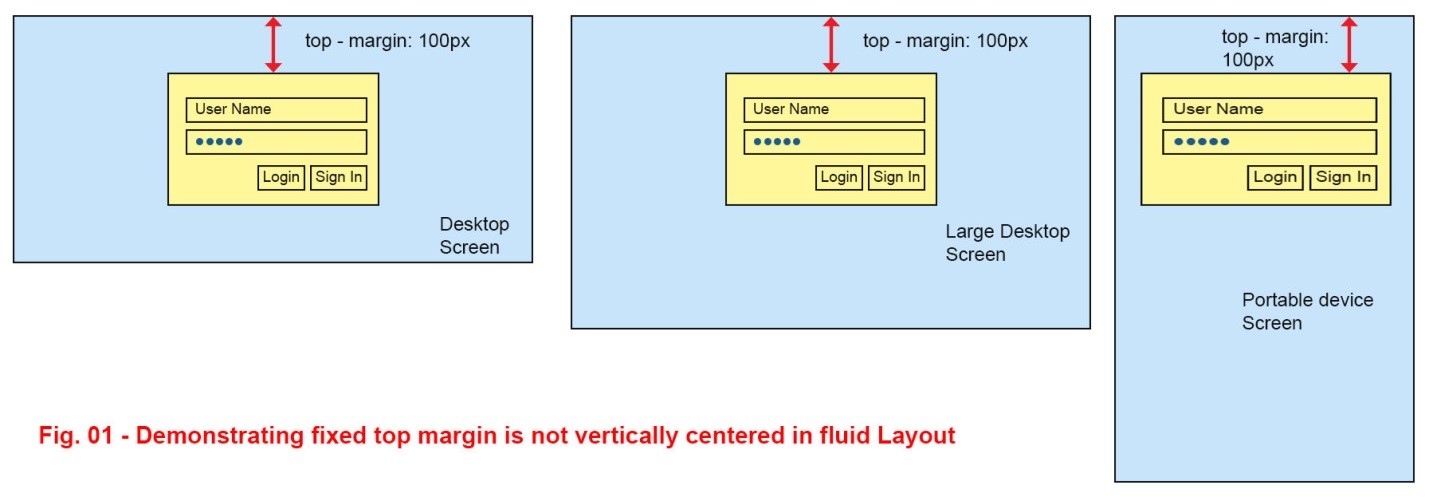
If you have to design a traditional layout with fixed resolution for a desktop having 1000px wide and centrally aligned for wider monitor, then you use dimensions in pixels. However, if you need a website which is flexible i.e. fits in browser with no horizontal scroll then fluid or liquid layout is for you.
In ‘liquid layout’ we use HTML elements dimension in percentages so main container element of body will take dimension of the browser window as 100% and adjust proportionally. Other child elements maintain hierarchy and adjust themselves accordingly to their own parent dimensions.

To have more responsive result and better usability, we need more control over element styling. For this we can use ‘media query’.
What is ‘media query’?
Media query is a CSS3 method by which we can detect the size of the browser in which website or web app are going to run. We can also put conditions on how the layout and CSS styling will apply for different resolutions.

What is CSS Grid layout?
Grid layout is the method in which we divide the HTML page area into columns using CSS3. For example, you can create class like ‘col1’ for 20% of width and ‘col2’ for 40% of width, ‘col3’ for 60% of width, ‘col4’ for 80% of width and ‘col5’ for 100% width. You can use these classes for different elements as required. Responsive web design tools such as Boilerplate and Bootstrap use same method and media query.

Keep looking for my next blog on tools and resources for responsive web design.